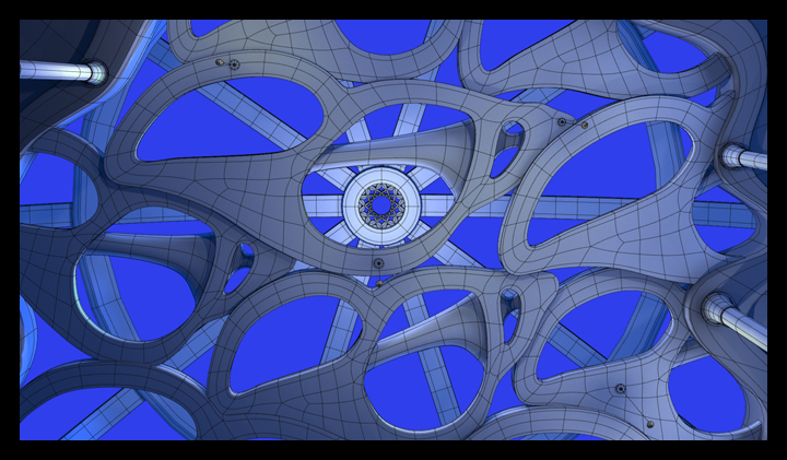
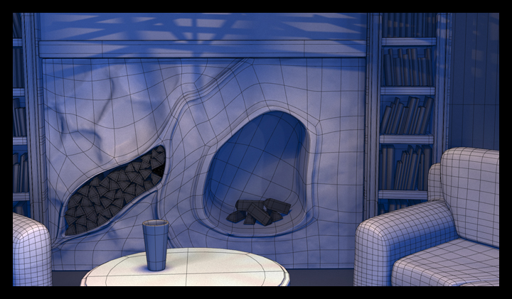
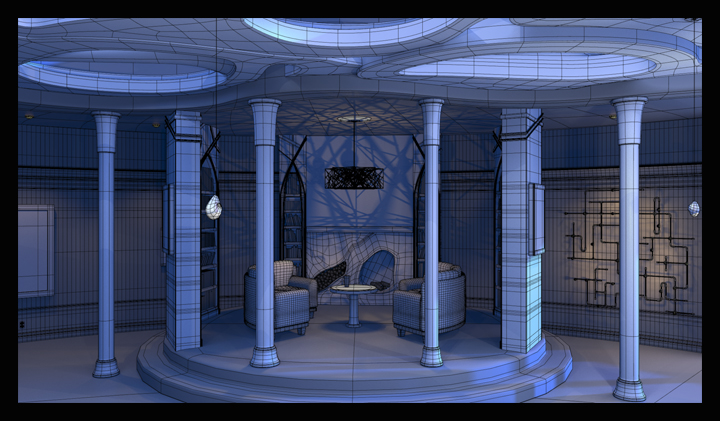
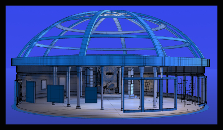
This is my thesis demo reel. It won't be my final reel (I'm allowed to make changes to it up until Tuesday, the day before my review). It was going to be my final reel for a day or two, but both of my instructors had some concerns over the varying line widths in the wireframe gallery renders, and I recently discovered a new way to render wireframes in Modo, so I'm revising the wireframes in which the line widths currently vary. I will also be replacing the high-res Addict model with the low-res, displacement mapped one.
Here are my new wireframe gallery renders:
And here is my new Addict wireframe turn-around:

This model is just over 20,000 polygons rather than the 325,000 polygons that the higher-res mesh contained.
I am also working on an additional pose for my Addict to show off the texture work that I did in the areas where he has to pull himself apart to unfold:
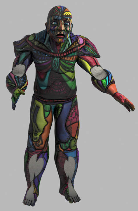
I'm not too happy with this image yet, but I'm having a hard time deciding how to fix it. His calves are much too wide, his head is too far forward still, and there are a few places where the geometry got tweaked in such a way during the posing that it's pulling on the texture. I can fix the first and last problems pretty easily: for the last problem I just need to make my final adjustments to the geometry with the texture applied, rather than blindly tweaking the low-res mesh alone, and to fix the first problem I just need to re-pose the head and the eyes. The width of the calves is the problem that I'm really wrestling with. They are currently as wide as they are because he was supposed to be built kneeling, which flattens out the calves quite a bit. Since he is supposed to be rigid, I feel like those calves should remain as wide as they are to keep the integrity of the character. However, it looks bad. It looks like I don't understand basic anatomy, and since this is a portfolio piece to show my skill, that's a problem. I think that I'm going to just end up fixing the shape of the calves until it looks better, but I still feel like I'm betraying my concept for the character by doing so...
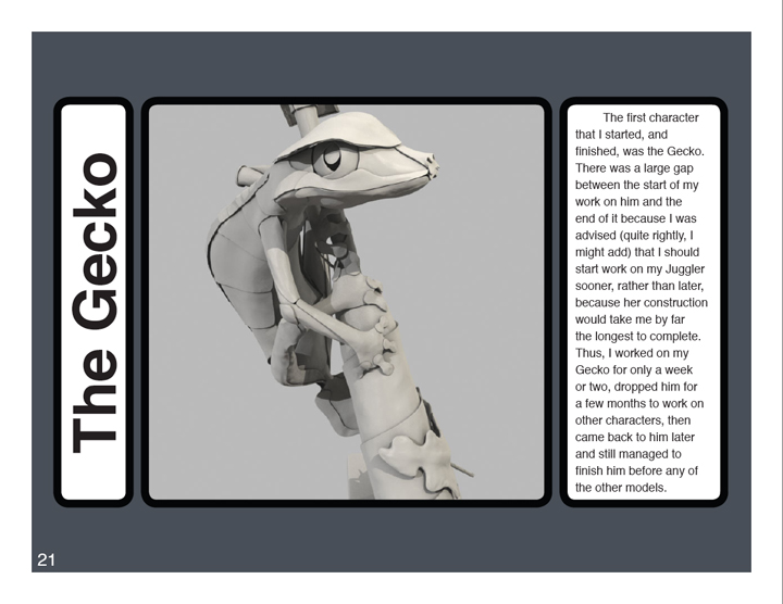
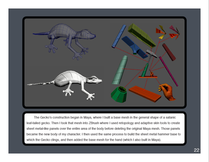
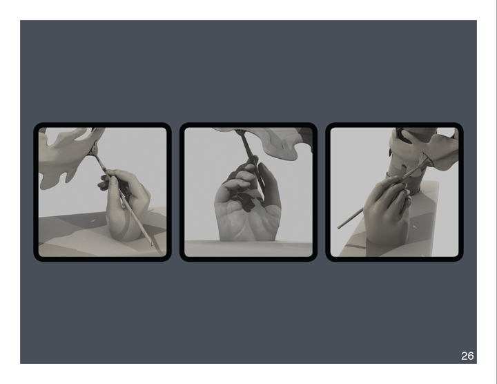
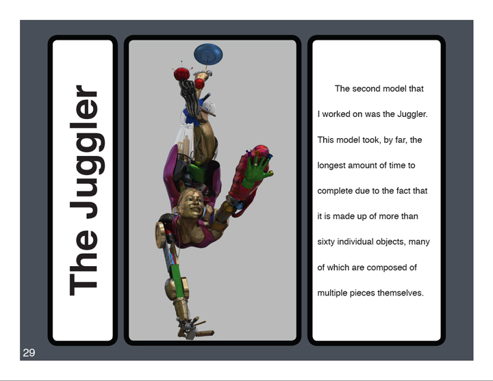
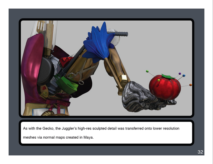
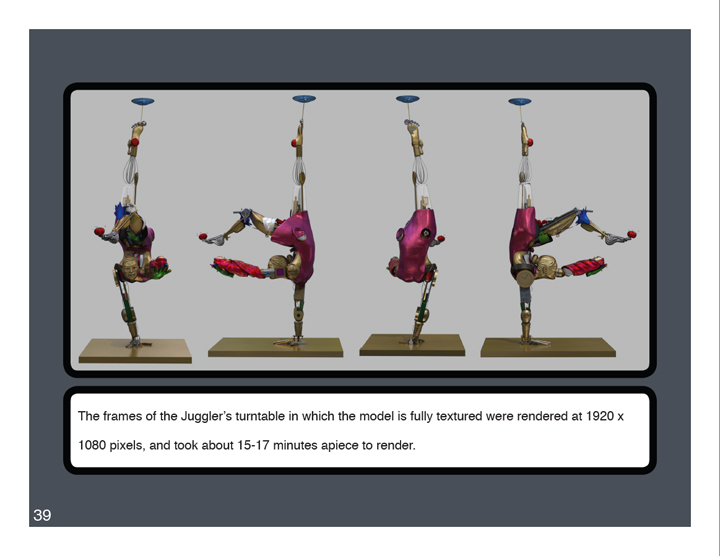
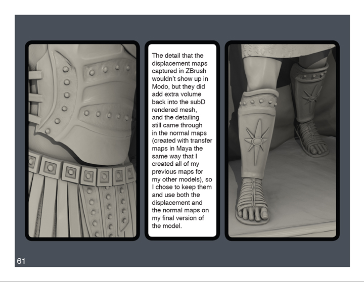
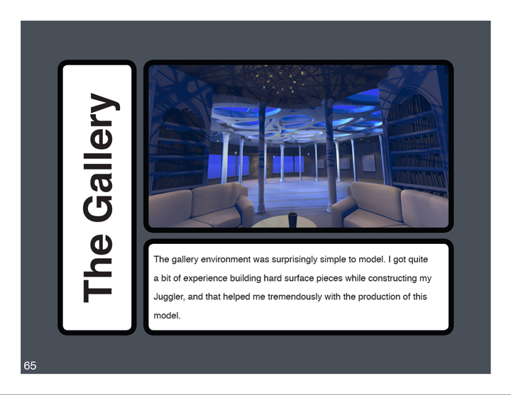
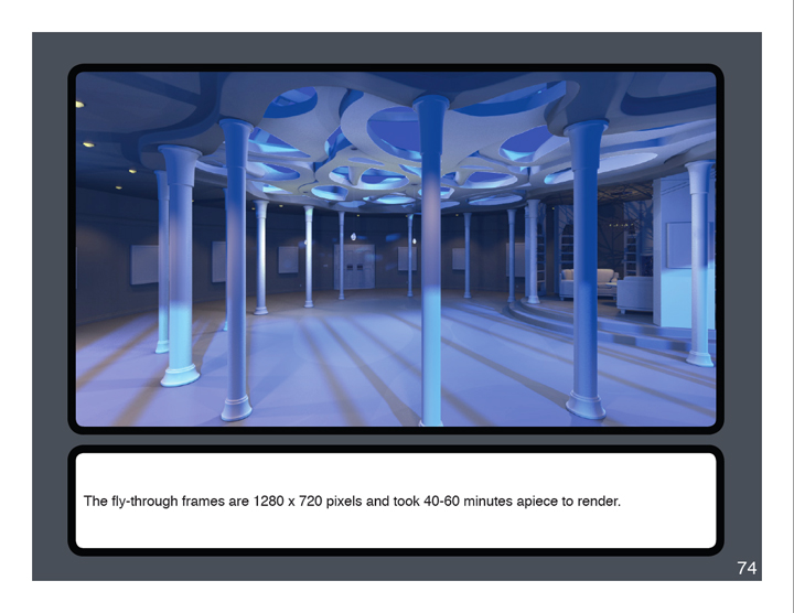
Anyway, those are the changes that I expect to make to my presentation in the next couple of days. As far as the work that I did to submit my thesis, however, it all came together pretty easily. I made/modified After Effects compositions for each of my characters and my environment and perfected their individual video segments in their own space, then I put all of the compositions together into a larger composition in which I created the transitions between the turntables and added the concept art frames and informational slates. Then I worked on the book. Well, actually, it wasn't so much "one then the other". I had already started work on the book prior to this past week, but as far as the order in which I pulled all of the pieces together goes, it was the reel first, then the book. It took me until Monday or so to get all of the beauty shot renders done. Then I had to go through them and prepare them for the book by adjusting and merging the layers of render passes and cropping images when necessary. I finished the written portions during render time. Then I just put it all together into a book format as best as I could. Here are a few sample pages:
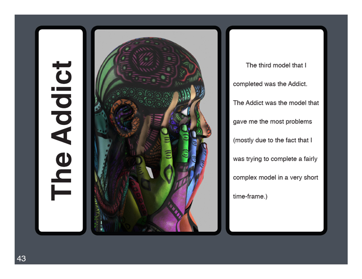
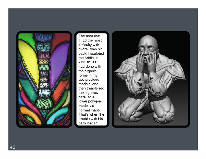

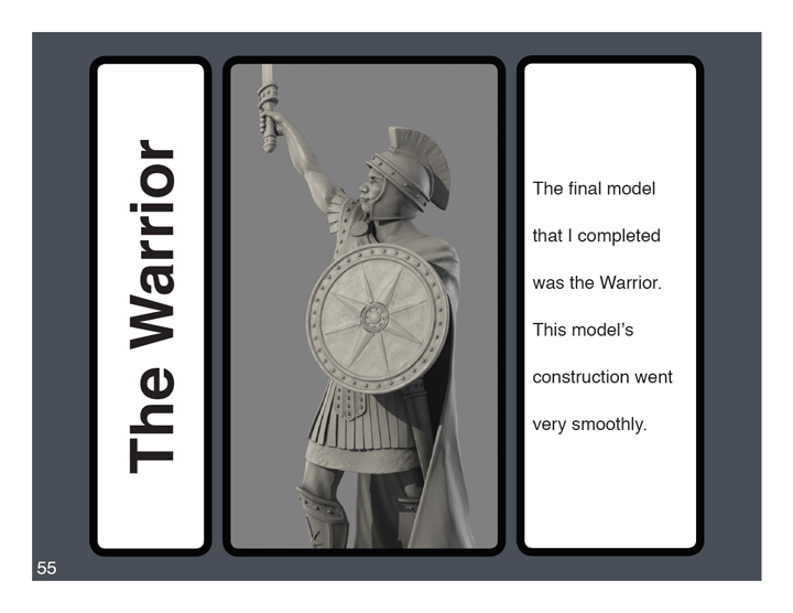
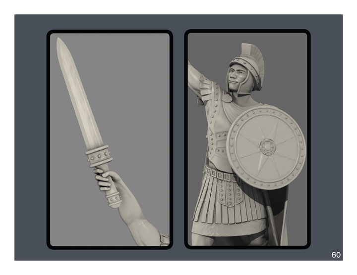
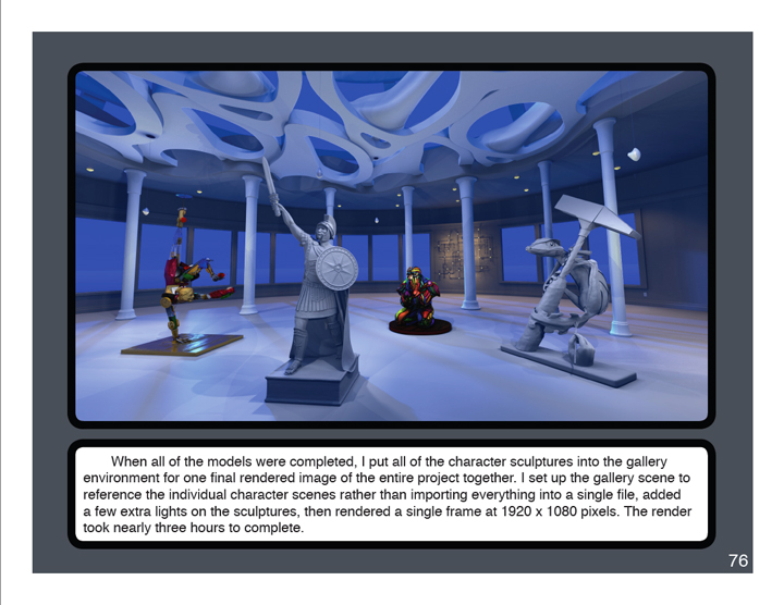
(I think that I forgot to mention that I re-rendered the inhabited gallery scene to produce the image in the page above. I moved the models around a bit, added some extra lights, and used a wider angle lens for the shot. At first, the shot had the same issue that I was having when rendering my Juggler: disappearing polygons and jagged-edged meshes. Then I finally stumbled upon a solution to the problem online: I had to increase the geometry cache size in the render settings. The time to render this frame dropped from over eight hours the last time around to only three hours with the geometry cache raised. Needless to say: I approved.)
The whole book is 83 pages currently, but will probably expand to 85 by the time I add the revisions.