At the beginning of my third week of directed study I took a day off from sculpting my Addict and worked on building my Gallery structure. I built the walls as panels that I could duplicate around the room, but I had a bit of an issue with the curvature of the round room.
If I built the walls at a low resolution as I originally planned, the shape of the room would still be perfectly round everywhere once I welded the panels together and smoothed them except at the windows, where I was forced to put in extra edge loops to fit the window frames into the panels. The portions of the wall with the windows would have lost their perfect roundness and instead become slightly faceted as the extra edge loops held the geometry in place rather than letting it spread out evenly in perfect roundness. I was concerned that if this happened you would see the unevenness in the way the light hit the walls near the windows, even from fairly far away as my renders of the gallery will be.
My other option was to build the walls at a higher resolution, with vertical edge loops holding the definition of the curve all along the length of the wall at the same interval as existed between the edge of each panel and the edge loop defining the position of the window frame. All of the vertical edge loops would still be evenly spaced, and the curve of the wall wouldn't pucker from extra edge loops breaking the rhythm of the curve. The problem with this option is that it seems overkill to have high-res walls. Walls shouldn't have to be high-res: they're flat blank spaces with no detail to speak of. It seems ridiculous to have high resolution walls... In the end, however, I went with the ridiculous. I couldn't bear the thought of modeling the whole beautiful gallery only to be unhappy with the way that it renders because the curvature is slightly off at the windows and causing errant highlights on the otherwise-perfect roundness of my room. (Despite my best efforts, I did end up with extra vertical edge loops around the window frames as necessary holding edges, but you can't even see their influence in the curvature of the walls because the close intervals of the other vertical edge loops across the rest of each wall panel makes their influence so minimal that it's not even visible.)
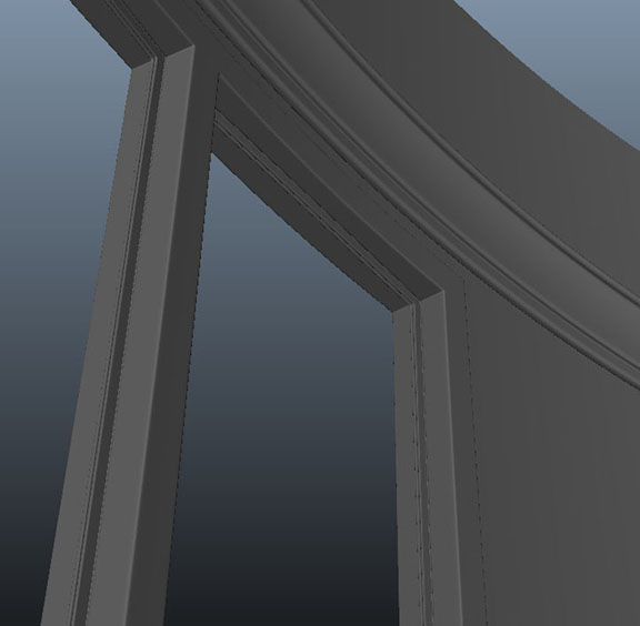
I spent quite a bit of time building the walls and windows: making the flat glass window panels fit into window frames on curved walls, modeling the trim around the window that holds the glass into place, making sure that the different panel pieces connect correctly... In the end, I wound up with five different window/wall panels to duplicate in various positions around the room: One blank wall piece, one full window piece, one wall piece with trim to finish off a window frame on the right, one wall piece with the trim to finish off a window frame to the left, and one wall with trim to finish window frames on both sides. You see, each window panel ends in the middle of the trim so that, when the windows connect, there's no wall area between them. This, of course, means that when a bank of windows ends the next wall panel needs half the width of trim on the edge to finish off the window next to it. Hence: five panels.
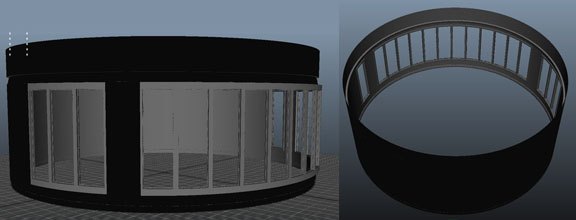
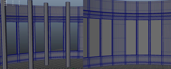
The last thing that I did in my gallery was block in the columns and major furnishings. This process actually caused me to resize and slightly reproportion my room when I discovered how little room I had left for the reading nook. The way I see it, your average couch is probably around five feet in length; when I made my couches that long they took up very nearly the entire floor space of the reading nook, leaving no space to actually access the bookshelves. So, I thought again. I moved the five-foot couch place-holders over to the reading nook area of the floor plan, then resized the floor plan image plane to fit them, leaving enough room to walk around and between the couches to navigate the nook area. Then I scaled the walls up evenly to fit the newly resized floor plan. I then scaled the height of the walls back down so that my ceilings weren't ridiculously high. In a room this grand, I do want high ceilings, but not completely, outrageously high. I've decided on an eight inch crown molding at nine feet with the actual ceiling topping out at twelve feet. I've been in houses with nine foot ceilings before and they're really nice, but I think that in a forty-five foot in diameter room (which is what the gallery turned out to be after resizing for the nook) they'd make the space feel just a little bit claustrophobic; so I settled on twelve foot ceilings. I then spaced out place holders for the columns and bookcases surrounding the reading nook, and that was the end of my work for the day.

For the next few days, I finished sculpting my Addict:
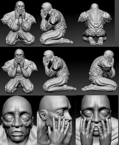
Tareq had mentioned when I turned in my last week's progress that the character's wrists looked broken: that the hands met the arms at the wrong angle. I worked to remedy that problem, then went on to finish sculpting the face, refining the hands, and sculpting the divisions into the forearm sleeves. Then I exported the 2nd subdivision level character mesh, unfolded the UVs a bit, and baked my normal maps:

I was concerned that I was going to get a lot of problem areas in the normal map where the geometry of one part of the body pressed against the geometry of another part in the pose that he's in (i.e.: the fingertips pressing against the face, the back of the thighs pressing against the calves, the inner elbows pressing against themselves), but, surprisingly, I had very few issues. I did end up separating out some pieces of the high- and low-res meshes and re-baking normal maps for certain areas (such as the face) and compositing the new maps into the the full body one, but I didn't have to do this for nearly as many pieces as I expected to: most of the anomalies in the map were able to be fixed with just a bit of healing brush application in Photoshop.
Then I started work on the color map.

The image above took about a day's worth of work to complete - a very full day of work, but a day nonetheless. In this map, nearly all of the precise divisions are done. The shoulder pads and the ears still have to be subdivided according to the information in the normal map, but the rest of the precise linework is done. It looked great on the model:

I figured that it would take another day or so to complete the designs in the color section on his body. After all, the designs are just doodling - most of the precise work was done.
Oh, how wrong I was...