My thesis project has been approved consisting of four character models (The Addict, The Warrior, The Juggler, and The Gecko) and one fully furnished gallery environment space. The Addict has previously been introduced as character #1, and now I present to you Character #2: The Warrior:
First, as with all of my designs, I spent some time gathering reference for the overall design of the character. The concept for this design is a wooden sculpture of an ancient Roman warrior in a classic hero pose. This is the only character in my thesis that would actually have a physical role requiring a range of motion in the animation, and he will be built accordingly.

I believe I spent more time researching and brainstorming for the warrior’s design than I did for any of the other characters. He was the first character that I knew for certain would be part of this project (as stated in a previous post, The Addict was actually the first of these characters that I conceived, but I didn’t know right away that I would incorporate it into this particular project) and so I had enough of a cushion before the deadline by which I had to complete the designs that I felt free to sketch and discard a number of ideas before settling on a final look for the character.
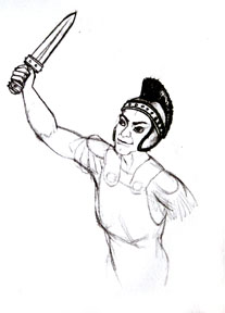
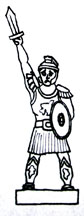
I began with the following sketch (minus the sword, clothing, and armor, which I added later after working on their designs a bit) to get the overall pose and heroic feeling that I wanted for the character:
I then moved on to sword designs.
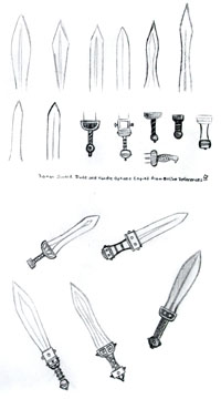
I researched information about historic clothing, armor, and weapons on the internet and found a few general sword shapes and designs that I dissembled (top 2 rows) and then mixed the parts to find a design that still seemed to fit the time period that I was aiming for (ancient Rome) but which also made him unique and conveyed the particular impression that I hoped for. Of the 5 designs that I came up with on this page (bottom half) I chose the upper right sword because it seemed like the most straightforward, sturdy design.
I don’t want the character to be frilly or feminine at all. The character is supposed to appear to be the epitome of the stereotypical male heroic figure – someone full of brute strength – just a hit-‘em-and-hit-‘em-hard kind of guy. The other swords I envisioned either had too many design details – too many frills – or didn’t look like they’d stand up well to hard knocks - my big, strong warrior can’t have a feeble sword.
Once I got the sword design ironed out I moved on to the rest of his armor. Up first, the helmet:
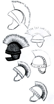
I tried a few different designs and then decided to echo the design elements of the sword in the rest of his armor to give him a cohesive look. I liked the design second from the bottom, but wanted to try extending the crest all the way down to the decorative band. I drew the helmet again with the adjustment and was quite pleased. The helmet looks much more solid to me that way: more anchored.
I called that good (or, better than good really – more “exactly what I wanted”) and moved on to my next piece of costume design.
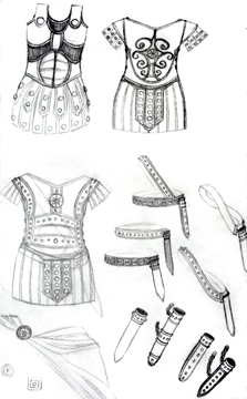
Ok, so this is much more than one next piece of costume design, but what can I say? I drew a bunch of elements on the same page… The first thing I designed on this page was the torso armor (for lack of a better word – it’s been awhile since I did the research and I’ve forgotten the technical terms for all the different pieces). I knew the general look that I wanted for the overall shape of this armor, but I had particular trouble with what kind of design to put on all that open space on the front of the breastplate. At first I tried outlining anatomical shapes to highlight the characters muscular build, but that looked odd (upper left). Then I tinkered with a history-inspired design on a breastplate, but that one looked to feminine (upper right). Finally, I tried drawing some lines near the divisions between the major muscles of the torso and then expanded on those with the same banded design that I used around the circumference of the helmet and the sword handle, which worked out well. After getting that settled I moved on to designs for the sword belt and sheath. Once again I started out much too fancy and decided that for this character simpler is better. I chose the bottom-most horizontally oriented sword belt and the simplest single-banded sheath. I designed the broach to pin a cloak on as something of an afterthought, pulling the design from the medallion I had placed on the chest of the breastplate.
As I designed the costume elements I added them one by one to the character design that I had sketched out earlier and realized before long that this view wouldn’t work at all – you can hardly see the costume behind the shield.
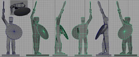
So, I moved on to overall character design. After a few failed attempts to draw my warrior from another angle I decided to get some perspective help from Maya. I modeled a very simple blocked-in model of my character and printed out some screen shots of a full turn-around of the model to use as reference for the best perspective that would show off all of the design elements of my character.
I then placed the image on my lightbox and traced the general outline, then filled it in with greater detail. I realized as I was working on this full-body design that I had forgotten to design a couple more elements of his costume: the shin guards, sandals, and shield. The shield was easy – I basically designed that on the fly while I was sketching. I grabbed the only circular design element that I had previously included anywhere in his costume design – the breastplate medallion and brooch – and enlarged it. I added just a little extra interest to the design by creating an edge border from the banded design used elsewhere in his costume because the medallion design alone was just a bit too boring enlarged to that scale, but I had learned from designing the previous bits of equipment to keep it simple. I drew the roman sandals right onto the character design from online reference – again, just choosing the simplest, sturdiest style that I could find. Finally, I designed the shin guards:
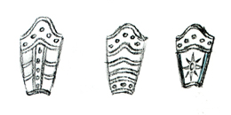
I actually had quite a bit of trouble with this design. I was at something of a loss as to what to draw when I started designing these. I drew the first two designs and decided that having a bunch of horizontal or vertical bands across these things just looked much too busy, but I had a hard time not making them too plain.
I know it appears that I drew just three designs here, but, actually, I didn’t get to the busy designs right away. I tried to start simple first, but nothing worked. I drew the first design on the left without the small horizontal bands first, but it was too much open space, then the extra bands made it too busy. Then I drew the middle design with just the top and bottom bands, but, again, there was too much emptiness, and, again, the horizontal bands I added made it too busy. I decided to try to echo the sword sheath by just putting the band across the top in the third design, but I had the empty space problem again – it looked like I’d just gotten tired of designing and had said “good enough, I’ll leave it at that” with that design… Finally, I decided to stretch my circular design element to fit in the open space, since it was the only non-banded design element I had previously established and the bands clearly weren’t working. To my surprise it worked out great. I was very happy with it, so I added it to my character design.
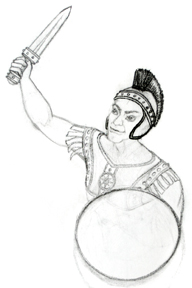
After quite a bit of time, using the Maya model established reference angle and all of the costume design bits that I had completed, I came up with this character design:
When I took a step back, I hated it.
I loved seeing all of the elements of the costume design brought together – I was happy with each and every one of them – but I hated the character himself. He looked feeble. He looked like a kid almost drowning in his armor. He didn’t radiate brute strength. And what was with that pose...? What is he supposed to be doing with his sword there? The storyboards I drew had him thrusting his sword into the air, holding it high for all to see:
This guy’s attempt to mimic that is half-hearted at best… I realized that a large portion of the blame for his appearance was that Maya model I made. I blocked in the character too quickly. I didn’t take time to flesh him out because I didn’t think I needed to when it was just for determining a viewing angle, but, clearly, I relied much too much on the shape of that model when drawing the character.
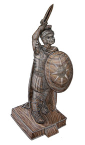
So, I tried again, using the poor character drawing for angle reference, but nothing more. And I tried again. And then again. Finally, I came up with this:
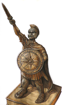
I am much happier with this design. I drew it with charcoal pencils and then painted in the wood grain with watercolors. The design could use a little tweaking here and there, but I think it’s good enough for me to go on with.
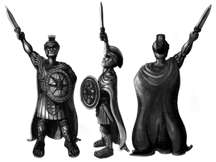
I then created these turn-around images with white and black charcoal pencil and I’m pretty happy with them too, though they don’t really line up with one another as they ought to.
Overall, I’m happy with the design and I can’t wait to get started on him.
I could still go on and on about this character. I’ve put a lot of thought into him because he’s the main character of my story. I could tell you all about his personality in the short and describe in detail the kind of textures that I’ve chosen to make for him (some of which I’ve already tested a bit even), but since the textures didn’t actually end up in my thesis project and I plan to get to the plot of the short another week, I think I should leave it here for now.